Why This Article is helpful for Us :
This completely changes the quality of your excel dashboard and helps create executive-level reporting systems much faster.


4
Why do people use Excel in Wrong Way ( Excel Dashboard) :
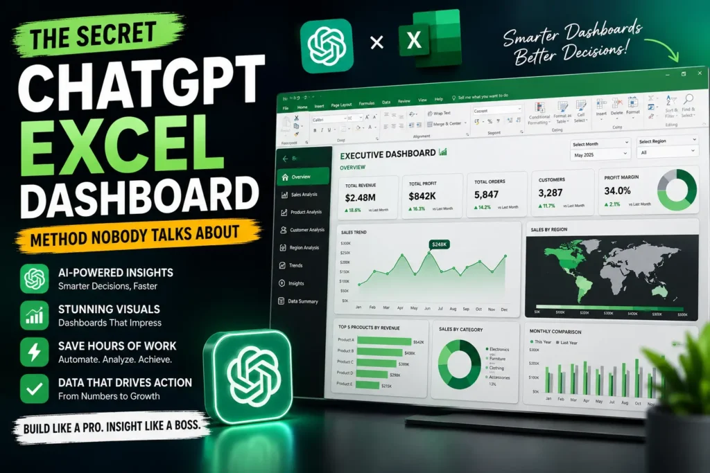
Creating a professional excel dashboard used to take hours of manual work, complex formulas, and endless formatting. But with ChatGPT, you can now build smarter, faster, and more interactive Excel dashboards that look like enterprise-level business intelligence systems.
They ask it for formulas.
Maybe a quick VBA macro.
Sometimes a chart suggestion.
But the real power of ChatGPT for an excel dashboard is something almost nobody talks about: using AI as a dashboard architect, not just a formula generator.
That single mindset shift changes everything.
Instead of spending 6 hours cleaning data, choosing charts, building KPI cards, formatting layouts, fixing broken formulas, and redesigning visuals… you can create professional dashboards in a fraction of the time.
And no, this isn’t one of those fake “AI does everything automatically” tricks.
This is a practical workflow used by smart Excel users who combine AI prompting with dashboard strategy.
In this guide, you’ll learn:
- The hidden ChatGPT dashboard workflow
- How to structure prompts correctly
- The best dashboard layout method
- AI tricks for KPIs, charts, and slicers
- Common mistakes people make
- A faster way to create executive-level reports
If you work with reports, analytics, finance, HR, sales, or business intelligence, this method can completely change your workflow.
Why Most Excel Dashboards Look Bad


4
Here’s the uncomfortable truth:
Most dashboards fail because people start with charts instead of strategy.
They open Excel and immediately begin:
- Inserting graphs
- Changing colors
- Adding slicers
- Creating random pivot tables
The result?
A dashboard that looks busy but tells no real story.
Professional dashboards work differently.
They answer 3 questions instantly:
| Dashboard Question | Purpose |
|---|---|
| What is happening? | KPI summary |
| Why is it happening? | Trend analysis |
| What should we do next? | Actionable insights |
ChatGPT becomes powerful when you use it to plan those answers first.
The Hidden ChatGPT Dashboard Workflow


4
This is the exact workflow advanced users quietly use.
Step 1 — Give ChatGPT Raw Business Context
Instead of asking:
“Give me an Excel dashboard.”
Ask this:
I have sales data with:
- Date
- Region
- Product
- Revenue
- Profit
- Salesperson

I want an executive dashboard for monthly performance review.

Suggest:
1. Best KPIs
2. Best charts
3. Dashboard layout
4. Color strategy
5. Interactive filters
6. Business insights executives care about
This changes the quality completely.
Now ChatGPT thinks like a business analyst.
Step 2 — Let AI Design the Layout First


4
The secret most people miss:
Great dashboards are designed BEFORE they are built.
Ask ChatGPT:
Create a dashboard wireframe layout for this data.
Explain where KPIs, charts, filters, and tables should go.
You’ll often get something like:
| Section | Purpose |
|---|---|
| Top Row | KPI Cards |
| Left Side | Filters/Slicers |
| Center | Revenue Trends |
| Right Side | Regional Comparison |
| Bottom | Detailed Insights |
This instantly gives structure to your excel dashboard.
The AI Prompt That Saves Hours
Here’s the advanced trick.
Instead of asking for formulas one-by-one, ask ChatGPT to generate the entire dashboard logic system.
Example:
Generate all Excel formulas needed for:
- Revenue growth %
- Monthly comparison
- Top 5 products
- Dynamic KPI cards
- Conditional formatting alerts
- Interactive chart ranges
This eliminates repetitive work.
It’s especially useful when working with:
- Power Query
- Pivot Tables
- Dynamic Arrays
- XLOOKUP
- INDEX MATCH
- Conditional Formatting
Best Excel Dashboard Structure (Recommended)


4
Here’s a structure that works extremely well.
1. KPI Section
Always place KPI cards at the top.
Include metrics like:
- Total Revenue
- Profit Margin
- Sales Growth
- Conversion Rate
- Customer Retention
Pro Tip
Use icons and conditional formatting for visual impact.
2. Trend Analysis Charts
Use:
- Line charts for time trends
- Column charts for comparisons
- Area charts for cumulative growth
Avoid:
- 3D charts
- Pie chart overload
- Too many colors
3. Interactive Filters
Your dashboard should feel alive.
Add:
- Slicers
- Timeline filters
- Drop-down selections
ChatGPT can even suggest the best filter combinations.
4. Insight Area
This is where elite dashboards stand out.
Add a small section explaining:
- Biggest revenue drop
- Best-performing region
- Unexpected trends
- Monthly highlights
Executives care about interpretation more than charts.
ChatGPT + Power Query = Game Changer


4
Most dashboard time is wasted cleaning messy data.
This is where ChatGPT becomes dangerous—in a good way.
You can paste messy column names or raw data structure and ask:
Create Power Query steps to:
- Remove duplicates
- Standardize dates
- Merge tables
- Replace null values
- Create calculated columns
Suddenly your data pipeline becomes semi-automated.
This is one of the biggest productivity upgrades for dashboard creators.
For official Power Query documentation, visit Microsoft Excel Power Query Guide
The Dashboard Design Rule Nobody Mentions


4
Most dashboards fail because they try to impress instead of communicate.
Professional dashboards use:
- White space
- Minimal colors
- Consistent typography
- Clear hierarchy
- Limited chart types
A powerful rule:
If your dashboard needs explanation, it’s too complicated.
ChatGPT can even help simplify dashboards.
Ask:
Review this dashboard structure and suggest simplification improvements.That’s an underrated use of AI.
Real Productivity Gains
Here’s what actually changes when using this workflow.
| Task | Traditional Time | With ChatGPT |
|---|---|---|
| KPI Planning | 1 hour | 10 minutes |
| Formula Creation | 2 hours | 20 minutes |
| Dashboard Layout | 1.5 hours | 15 minutes |
| Data Cleaning | 2 hours | 30 minutes |
| Insight Generation | 1 hour | 10 minutes |
The biggest benefit isn’t automation.
It’s reduced mental fatigue.
You stop staring at blank spreadsheets wondering what to build next.
Common Mistakes to Avoid

4
1. Too Many Charts
More charts ≠ better dashboard.
Focus on decision-making.
2. Ignoring Mobile Screens
Many executives open reports on laptops with limited space.
Keep layouts compact.
3. No Data Story
A dashboard without insights is just decoration.
4. Overusing Colors
Stick to:
- 1 primary color
- 1 accent color
- Neutral backgrounds
5. Weak Data Structure
Messy raw data destroys dashboards.
Always organize tables first.
The Advanced AI Dashboard Trick
This is where things become truly powerful.
Use ChatGPT to simulate stakeholder thinking.
Prompt example:
Pretend you are a CEO reviewing this dashboard.
What additional insights would you want?
This produces ideas most people never consider.
Examples:
- Forecasting trends
- Risk alerts
- Regional profitability
- Customer churn indicators
- Inventory inefficiencies
That’s how ordinary dashboards become executive dashboards.
Recommended Tools Alongside ChatGPT
| Tool | Purpose |
|---|---|
| Microsoft Excel | Dashboard building |
| Power Query | Data transformation |
| Power Pivot | Data modeling |
| ChatGPT | AI assistant |
| Canva | Dashboard mockups |
| Power BI | Advanced visualization |
For official Excel dashboard resources, explore Microsoft Excel Training Center
My Personal Observation After Testing This Method
After experimenting with multiple dashboard workflows, one thing became obvious:
People waste time on technical complexity instead of dashboard thinking.
The users getting the best results with AI are not necessarily Excel experts.
They’re the people asking smarter questions.
That’s the hidden advantage.
ChatGPT dramatically reduces the “what should I build?” problem.
And once clarity improves, dashboard quality improves too.
Final Thoughts


7
The future of the excel dashboard isn’t just automation.
It’s AI-assisted thinking.
The secret method nobody talks about is simple:
- Use ChatGPT for planning
- Use Excel for execution
- Use AI prompts for insight generation
- Use dashboard strategy before design
That combination is incredibly powerful.
And honestly, once you start building dashboards this way, it’s hard to go back to the old manual process.
Frequently Asked Questions
Can ChatGPT create an entire Excel dashboard automatically?
Not completely, but it can generate formulas, layouts, KPI ideas, VBA scripts, Power Query steps, and dashboard structures extremely fast.
Is this method beginner-friendly?
Yes. In fact, beginners often benefit the most because AI removes much of the technical confusion.
Does this work with Power BI too?
Absolutely. The same dashboard planning workflow works for both Excel and Microsoft Power BI.
CTA: Start Building Smarter Dashboards
The next time you open Excel, don’t start with charts.
Start with AI-assisted dashboard planning.
Try this workflow once and you’ll immediately notice:
- Faster dashboard creation
- Cleaner layouts
- Better business insights
- More professional reports
If you found this guide useful, share it with someone who spends hours building reports manually.